Showing posts with label s/s 2011. Show all posts

Balenciaga and Chanel...boots!

I PREPARED THIS POST BEFORE I WENT TO NEW ZEALAND, AUCKLAND AND THIS IS THE REASON I PUBLISH IT. NOW I'M HERE AND I USE AN INTERNET KEY THAT ALLOWS ME TO CONNECT TO INTERNET. BTW, THE CONNECTION IS NOT VERY GOOD AND I FIND A BIT COMPLICATED TO MAKE POST AND TO COMMENT ON OTHER BLOGS. SO I'M REALLY SORRY BUT FOR THE FOLLOWING THREE MONTHS I WILL NOT PUBLISH ANYTHING ON  (I WILL RETURN TO MILAN IN THE END OF SEPTEMBER AND THEN I WILL RESTART TO POST). I HOPE YOU ENJOY YOUR SUMMERTIME AND THAT THE HAUTE COUTURE WILL LEAVE US SPEECHLESS!


Since Jak&Jil published that pic...Those Balenciaga boots had a great diffusion on Ashley Olsen, for example. So I don't think that these boots really express the Balenciaga aesthethic but they are very nice and have a lot of nice details, such as  "lateral opening" which allows the socks to be a part of the look. These boots belongs to the s/s season but Lagerfeld decides to repurpose this trend also in the winter. In fact during the "volcanic show", literally, Chanel showed those boots and  they are a more "simple", almost minimalistic, version of the Balenciaga ones. So I believe that the Balenciaga's boots are mroe innovative, more particular but the Chanel ones are more wearable and communicate  in one of the clearest way the Lagerfeld vision of fashion.
Which one do you prefer?


Pic from Jak and Jil
Images from:
Vogue (Chanel f/w 2011)

Lane Crawford (Balenciaga Boots)
Jak&Jil (Last Pic)


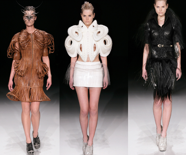
Iris Van Herpen...a talentuos young designer!

Iris Van Herpen is  a young and a very talentuos designer who worked also with McQueen and that has a unique, really, point of view about fashion. Some shapes could be similar to some David Koma's sresses, the shoes could remind us some McQueen's pieces, but the use of fabrics and the "aesthethic" is absolutely new and unique. On her website she explains in a  wonderful way every collection and her own vision so I don't believe that I need to say something else, watch and enjoy these pics...


Images from: 
Iris Van Herpen


John Richmond campaign...so gothic!

I saw this campaign on the "L'uomo Vogue" magazine and I'm really sorry that some parts of these pics are deleted but I hope you could understand the "meaning" the same. These drawings communicate the essence of the gothic and rock'n'roll style of John Richmond. The black and white and the dark style of the adv I believe that give us the best image of this maison. I do love that this campaign is not the classic one where clothes, accessories and so on are simply "shown"... here the idea is to express the DNA of Richmond and not just a collection.
There are some words written on the adv, I tried to enlarge them but I don't think that you can see them. So I write these "sentences",.
"Lies sex religion", "destroy disordinate disorder", "vos quod intereo fuck" ("intereo" is a latin verb that means "to die", "vos" means "you" and "quod" means "because or that"  and the sentence could be translated, but I'm not sure as "you that I kill, fuck!".
All these phrases express a feeling of "disorder" that these brand communicates through its collections. These words, in the order in which they are put and with these drawings, give us a sense of "movement" and "chaos", that has a wonderful effect for me. 


Rodarte...McQueen: wedges!

McQueen and Rodarte are absolutely two of the most important brands of our epoque. Both have an avant-garde and peculiar style that, sometimes, could be exaggerate and sometimes so lovely. In general, these two brands have different styles that have nothing in common.
However, in this case we can see a general concept that is shared by these two models. These wedges are amazing by a fashion point of view. In fact, the "constructed-heel" in a baroque and opulent style gives to the entire wedges an innovative appeal that makes these shoes unique in their style. The main feature of Rodarte wedges is the decoration on the silk and the use of wood: wood is the theme on which Rodarte’s s/s show was developed. Alexander McQueen, or better Sarah Burton, decides to use flowers (white, gold or black) as a heel. The general aesthetic is baroque, with some touches of a "gothic-romanticism" for McQueen and "Kirkwood's ones" for Rodarte.
So,  I don't think that we can speak of a "copy" but it’s better speaking about a common inspiration, a "small trend".
 I love the idea (that is characterizing the contemporary heels) to consider the heels as a “beautiful part” of the shoes and not simply a support for the overall accessory. In this way, the creativity, and so the designer, has more freedom and could create this art pieces.


Images:
Vogue
Net-a-Porter


Spring prints...Tahiti and fruits!

Stella McCartney and Prada prints, for this spring are appearing in every editorial and almost everyone loves them. The chic appeal, the sense of summer and funny approach to fashion is abosolutely  gorgeus. Fashion magazines, fashion cities, fashions tores and fashion customers  in general are in big cities. It's difficult to find, for example, a Gucci boutique in the countryside. So, we need to leave the stress that is caused by the city life and the conformist elgance. The designers, as they only know how to do, abandon these schemes and purposed a wonderful trend. Gaultier in his Haute Couture decided to use "tahiti prints", taking inspiration from Mexico, and Just Cavalli too. Moschino follows the trends and the amazing thing is that every brand present its own interpretation of this concept (and this personal approach is something that sometimes brand forget and, unfortunately, they copy each other).
So for this spring the idea is beautiful but I hope that these tendance will be developed in the right way, maybe on the style of Stella McCartney (and not Cavalli...please!) that is the designer who shows the most elegant version of fruits print.


Images via:
Vogue


Mary Katrantzou...s/s 2011!

Mary Katrantzou is a designer that is conquering the fashion world with her wonderful prints and her absolutely new and fresh style. 
I find on Net-a-Porter this amazing long dress, which close the s/s 2011 show, with a classic print of Mary and  two black sheer silk-chiffon ruched drapes at side. 
As you know, fringes are one of the trends of this s/s and a lot of brands such as Gucci, Balmain.... use this decoration. Those two chiffon pieces give to the dress a movement that is like the movement given by fringes but in a more "legant" and innovative way. Katrantzou styel is strange and sometimes could appear a bit exaggerate but I think that with this dress, or in general with her last shows, she is really improving her style and moving to a more elgant one. I hope that she will never abandon these amazing tridimensional prints which make her so unique and different from the other designers. 
 The dress is all realized in silk and, of course silk-chiffon.


Images and shop on-line:
Net-a-Porter


Complete collection:
Vogue Italia 


S/S 2011...Volumes and extravagant!

 Speaking about volumes, Japanese designers are very interesting and they are the best ones in making "extravagant clothes". Commes des Garçons' family (Tao, Rei, Junya) developed big volumes on skirt and top with, sometimes, asimmetry in a way that is absolutely innovative. Yamamoto, who normally uses long and slim silhouettes, decides to create a big knot that makes the coat just right for very convinced fashionistas. V&R are maybe the only designers who are able to develop such big volumes (think to that s/s where, quoting world economic crisis, they produced exagerate gowns with some "holes"...). 
However, Valli created nice volmes on skirts...but Margiela, the Belgian designer who influenced our fashion era in such an important way, designed a really "strange shirt". In particular the top looks like a flat squared which modifies at all the silhouette of woman body. It's  of course an important piece of design but I don't think that this could really have a commercial succes or being wearable. And CDG top is of course unwearable (this is only a good fashion creation), Viktor and Rolf are unwearable too, I think... So, Valli and Tao (unexpectedlyfor this last one...) are absolutely perfect in the right occasions.


Images via:
Vogue


Maison Martin Margiela... Boots!

Since Martin Margiela has left his label it looks as MMM is making for every collection more "conceptual" and absolutely "strange" clothes and accessories. After the "flat squared dresses" the creative maison presented this special shoes for the spring. The peculiarity of this boots is the avant- garde aestethic that I'm not sure if I like it or not. It's clear that the main risk is that the shoes seem a "broken" ones or that the shoes eats the feet. But this tendance of making shoes with unusual appearance or better like two shoes in one ( this model seems made up by the shoes and the sole, as a different part of the overall boot) is also purposed by Van Assche for Dior Homme. Dior made a nice sandal with a sock that could be wear together or separate. The Margiela's model and the Dior's one are absolutely different. But the element that unifies the two shoes is the desire, the trend, of making "constructed", "multiple", shoes with innovative and futuristic, sometimes, results.


Images and shop on-line:
Net-a-Porter


Balenciaga...raffia bags!

Spring is definetely arrived and, here in Milan, the weather looks like we are in summer. The sun and the blue skies let us think about sea and holiday in general. I think that bag are a very interesting accessory that during the summer could be really chic or absolutely boring. So Balenciaga purposes raffia these bags in different nuances of colors. The appearance is absolutely light in a chic style that caracterize every Balenciaga's piece. The shape are a bit classic but we are speaking of raffia bags so with this "unusual material" for everyday bags is better to maintain classic shape. The details are realized in leather and I think that this feature help the overall aestheic of the bag to be more "glamorous" and to abandon, at all, any referrement to beach style.


Images via:
Balenciaga


Brian Atwood...very elegant shoes!

Bridal shoes are, often, really boring. Classic white shoes, very elegant but, in general, they are all the same even if there are a lot of deisgners who try to make "innovative" shoes for bridal: from Louboutin to Blahnik, I was always bored by their creations (speaking about bridal shoes). 
Brian Atwood tries to be quite classic with an innovativer touch. This looks as a controsense, but I think that this is the best defintion for this shoes: an innovative classic aesthetic.
The heel measures 12 centimeters and the sandals are embellished with floral and shimmering Swarovski crystals. The satin, the flowers and the  glittered heels make these shape the most chic model and the most interesting one for a bridal. The only "problem" is the price, but for this piece of art I think that every price is right: on Net-a-Porter these shoes are sold for $3,440. The only thing that leave me in doubt is that these shoes could "move" the attention from the gown to the sandals. In fact accessories (shoes, bags and jewels....) should be only accessories and not the centre of the outfit. So this shoes are nice and wonderful, for me,  but there is the great risk that they "obscure" the gown.


Images and shop on-line:
Net-a-Porter


Matthew Williamson...feather skirt!

Matthew Williamson has a great talent in  macthing ethnic style with his vision of fashion and actual trends. In this case he created a skirt with feathers (that are a trend of this s/s) and sequins (another trend) on a gold fabrics (quoting Anna dello Russo, gold will be the new black...). SO this skirt si a summary of the main trend of thsi s/s and it's amazing from my point of view that such a small piece of fabric could represent all these things. Maybe the price is a bit high, but in some cases (and this is one of them) every price is acceptable.


Images and shop online:
Net-a-Porter


Hermès...lively adv!

Hermès campaign are always interesting. In fact, this brand makes adv that aren't a simple "show" of clothes, accessories and so on but Hermès tries with its campaigns to express the spirit of the collections or the maison.
In this specific case, a particular effect gives a lot of movement to all the pics and each shoes, bags....is matched with a "common object" such as scissors, hammer.... The color are bright  and in the first image we can admire a foulard that is "extended" to cover completely the body of that woman.  The image of this huge foulard was the one from which I was amazed. In fact, in that pic there are some small jars where there are some jam or, they also remind me, an ancient japanese medicine that use "colorated fires" to cure every disease. However, apart from each itnerpretation, it's clear that this image has a great aesthetic that, for me, made the adv one of the most beautiful of this s/s.


Bottega Veneta...so soft!

Bottega Veneta's handbags are so famous that sometime it looks boring to speak about them. However I think that Maier is doing a great work at this maison and sometimes it's interesting to stop and think about the concept on which he develops Bottega Veneta's bags. We all know Bottega Veneta for its luxury bags and intrecciato. But what about shapes?? For this spring, but in general too, the brand use soft shapes. We see that this s/s is caracterized by a great use of this kind of shape. Jil Sander Market bags (in plastic and in leather), Margiela Market bag, McQueen Faithfull, Marni... This is the time to leave strong and structured shape for softer ones. This is not an opinion shared universally but I think that is a right concept speaking about Bottega Veneta.
These three models are really different and the first two pics represent new bags of this spring. The last one is a classic bag. We see in all these bags a deconstructed shape where every single line is soft and the leather looks like a "flying on the bags". This effect, that is more clear in the first bag, makes these bags more new and interesting. The leather is really soft and so the aesthetic is more natural and less artificial than normal bags. This aspect is underlined by the "corners": they are "beveled" in order to improve the roundish appearance of the bags.


Images via:
Bottega Veneta


S/S 2011...ruches!

Ruches are conquering every designer. During the last seasons almost every brand decided to use this "decoration" in some different ways. For example, also Simons for Sander uses ruches on maxi skirts; the most minimalistic brand uses ruches. This is one of the things that I would not have ever imagined.
However, we see Valentino, Marchesa, McQueen, Ricci...everywhere an explosion of ruches. McQueen  is such an exageration of ruches that only Marchesa 's gown has more of them. 
I don't know if this is a trend that will end with this season or will continue...Speaking about f/w 2011 this trend is not so spread even if some brands use ruches (but, as I told, some maisons like Valentino and so on use ruches everytime.
Pilati for YSL is the only one who uses contrasting ruches. In fact, on the neck uses pink that contrast with blue and on the hem there is a little ruching underlined by some white pieces of fabric.


Images via: 
Vogue


Twitter Delicious Facebook Digg Favorites More